Tampilkan postingan dengan label green. Tampilkan semua postingan

Jumat, 21 Februari 2014

, ,

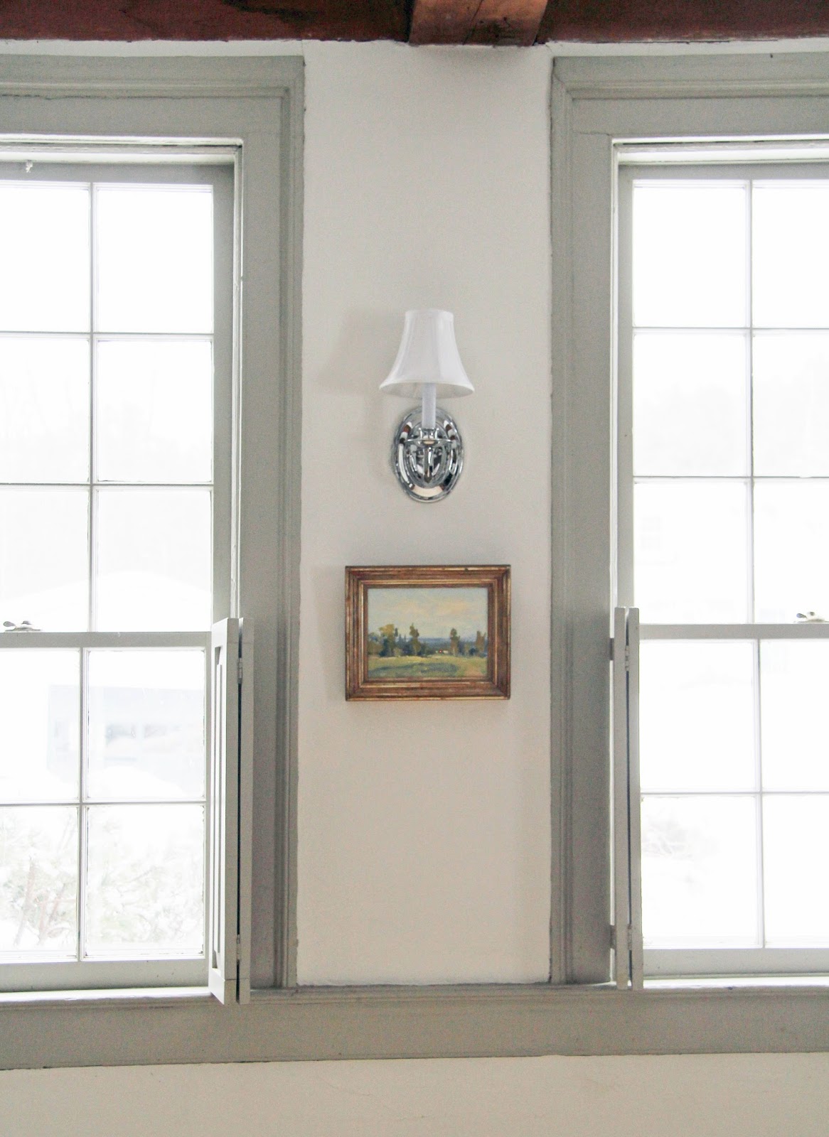
A New Sconce


Original light was a reproduction tin sconce. 


We replaced it with an $8 sconce I found at our local ReStore (while looking for something else). 

The shade comes from one of the old sconces we used above our fireplace in our old house

HAVE A WONDERFUL WEEKEND! 

Minggu, 16 Februari 2014

, , ,

The Upstairs Bathroom


This is the upstairs bathroom in our rental house as it was when we moved in. I was thrilled to see it because it had a lot of great features that could shine with a little TLC. My first thoughts were fresh coat of paint, new ceiling light fixture, replace mirror, and install new light sconces over sink. In addition, the homeowners wanted to replace the bathtub and sink as it has been on their to do list for quite some time, and had already selected new ones. 


So here's a little peek with the new sink and bathtub. 

The sink has a lip on it so it's easier to place things around the basin, which is a nice upgrade. The bathtub matches the lines of the original. After the tub arrived and sat in the dining room waiting for installation, Mike and I pondered out loud to one another how he and the homeowner were going to be able to move it upstairs. We then discovered, to our astonishment, that the tub is fiberglass

This before photo looks like a black and white image because the original paint was a light grey. We chose to paint the bathroom white because we had extra paint left from painting the hall and stairwell. The end result gave us a much brighter space. 

We kept the blue floors but added a large throw rug. It comes from Dash and Albert. Dash and Albert rugs are not chemically treated with stain repellants or flame retardants, which is absolutely wonderful. 


I tried all sorts of paintings above the bathtub and settled on The Torn Hat, in this case a reproduction of the original painting by Thomas Sully (1820). The mirror is the first example of our movement to use lighter woods in the house. I really liked the warmth that lighter woods offered in our old guest house, so we're phasing out the dark and adding the light. 

In the end, we opted to not upgrade the ceiling light or replace the sconces. Instead, to save money, we left the ceiling light and simply removed the old sconces. We economized by not replacing the sconces, but they were also off-center from the new sink. Thus covering their wallboxes with blanks and mirror made the best sense to us. 


I added my Grandmother's old buffet for storage (she used to keep napkins and See's candy in it and I can't help but think of that every time I open the drawers). 

Jumat, 24 Januari 2014

, ,

Antique European Textiles


When my dear friend Kate recommended an online source for antique French textiles, I found myself lost in a sea of never-ending awe and beauty. This was my first real peek into textiles such as these and my immediate feeling was, how could I never have known of such things? 

Wendy from The Textile Trunk is the most gracious caretaker of these historic threads. Her passion and love shine through in her endless knowledge and enthusiasm. I fell in love myself just reading her descriptions. But I did not truly comprehend her words until I held these threads in my own hands, when I purchased a 1900's French monogrammed sheet. 

It's so much heavier than I imagined with its dense weave of cotton and linen. 

But heavier than the material itself, is the weight of its presence. 


The monogrammed letters adorning the sheets had been hand-stitched by mothers, daughters, sisters, grandmothers. What beautiful imagery they invoke of these women, needle-in-hand, their thoughts, their art form. And such simplistic beauty so delicately woven into the common fabric of life.

Do you think these women could have imagined that over one hundred years later an American woman would hold their threaded beauty? Or that it would be a gift a mother would give to her daughter in two thousand fourteen? 

This heirloom textile will be made into a duvet cover for my daughter's bed when she is a little bit older. I absolutely love that these century-old threads will help keep her warm, holding her in their wonderful and inspiring beauty. 


I asked Wendy about the history of monogramming and this is what she told me: 

During the 19th century, it became de rigueur for middle class families to have every item of the trousseau monogrammed , in imitation of the aristocratic crests. A Trousseau was the collection of linens that a woman would bring with her to a marriage. Monnogramming the items in a trousseau was an art in itself , with special techniques and ruses for each piece. The style of monogram chosen often reflects the prevailing fashions of the entire epoch�.quite easy to distinguish. The monograms letters were often of the bride and groom, however these rules were not set in stone and some lunch napkins only were monogrammed with the woman�s initials. Creative license!

There were linen maids in the 19th century and nuns were often used also for the washing, monogramming, folding and stacking of linen. Often people employed linen maids, however washing the family linens was also something that the woman of the household would do. The sheets being washed sometimes in public laundry areas and hung to dry in the sun ( hence, the holder the sheet tended to become sun bleached with time from the many hangings! ) Linen cupboards were a status symbol and  the doors of the cupboards were sometimes left open ( accidentally) so show the many many stacks of fine linen a family owned! ( so I�ve been told! ) �.

A wonderful book to recommend on linens is : The Book of Fine Linen, Francioise de Bonneville  ~ so much wonderful information!

Minggu, 17 November 2013

, ,

Eastlake Mirror


I stopped in at our local ReStore yesterday and found the loveliest Eastlake mirror. I was looking for a full sized bed frame, so not sure (Mike is especially not sure) how I left with a mirror. 

It's in outstanding shape and for $45 I couldn't leave it behind. I actually purchased it with a specific spot in mind, though not on the wall where I took this photograph. I will keep you posted as we continue to finish our painting projects. 

Habitat for Humanity ReStores are not-for-profit retail stores that sell both new and used donated home goods. Their inventory ranges from furniture to appliances, lighting, and many other building materials. All proceeds go to support Habitat's efforts both locally and around the world. 

I first learned of ReStore when following Steve Thomas and his wife Evy's renovation of Sea Cove Cottage. Steve Thomas is spokesman for Habitat for Humanity International. You can follow along with their renovation here

Selasa, 22 Oktober 2013

, ,

Burlap and Horse Hair

I stopped in at the upholsterer the other day and found the Duncan Phyfe sofa stripped down to burlap and horse hair. It was actually quite fascinating. Seeing it in this state was a reminder of the era in which this sofa was built. But also, the tattered burlap, coarse horse hair and brass nails reminded me of the long history of the sofa. Unique among many of my antiques, it is a history that I am quite familiar with. 

After my Great Grandfather passed away, my Great Grandmother decided to sell their house in the Hollywood Hills and bought an apartment in downtown Hollywood. She hired an interior designer to help her redecorate her new home for her new independent life. This sofa was one of the items the decorator purchased on her behalf. 

After removing all of the pink satin fabric and the old cotton batting, the upholsterer assessed that the sofa is in good shape other than some uneven springs on the right side. She suggested that my Great Grandmother was likely prone to sitting on that side over the other, and thought that perhaps the lamp was on that side. 

This insight brought me pause as I thought of my Great Grandmother, who I met only when I was much too young, settling into her favorite side of the sofa. The sofa was telling a bit of her story, a small detail, but nevertheless, a glimpse of a life once lived. 

Before I left, I took one last look at the old burlap and horse hair because I knew I'd probably never see the sofa in that state again. I reveled in this secret glimpse into the bare bones of my Great Grandmother's sofa. After leaving her apartment, its next destination was to be nestled against a wall of green wallpaper in my Grandmother's house. That was my Father's old bedroom, and our playroom growing up. Now it sat laid bare, awaiting its next destination, and the next generation. Which side will we choose to sit on? 

I can't help but feel drawn to sit on her side, the side where the springs are worn a little more. This is the side on which my Great Grandmother sat, night after night, in her glamorous Hollywood apartment. 

The same steel springs that held her, will undoubtedly hold us. 

Catherine 

Senin, 14 Oktober 2013

, ,

A Victorian Children's Sofa

I found this antique Victorian children's sofa last year. It was shortly after I had purchased the wicker furniture set for the babies, which was a huge hit. I thought an indoor piece of furniture just their size would also be a lot of fun for them. 

Although in great shape, the sofa needs new batting and fabric. The fabric choice however - a pattern? a solid?, what color?, etc., sort of brought the process to a standstill. Recently however, my friend Kate shared with me the fabric she used to reupholster an antique wing chair for her office. It is a wonderful material, and I am going to replicate her idea for the children's sofa. I'll share it with you when it's completed. 

The Duncan Phyfe sofa project is also moving along. We just dropped it off at the upholsterers yesterday - with three boxes of organic batting, and ten yards of organic fabric. 

It will be done before Thanksgiving, which is very exciting. 

Senin, 07 Oktober 2013

,

A Cottage by the Sea


One of my favorite old house renovators is at it again, restoring the charm and integrity of a historic gem. This time, it's a shingle-style Dutch colonial in a little seaside village in Maine.

Steve Thomas, former longtime host of This Old House and current spokesman for Habitat for Humanity is documenting the renovation process of Sea Cove Cottage on his Facebook page.

He takes you through the entire renovation process, including the good (discovering maple floors hiding under linoleum), and the not so good (foundation rot), along with the many decisions he and his wife Evy make on a daily basis. They are assisted along the way by their fantastic design team of Robin Siegerman (interior, fenestration, furniture and lighting)John Tyahla (kitchen and cabinetry), and Anne Cox (landscape). Their story is set against the stunning backdrop of coastal Maine.

I love renovation stories like these because they offer the full scope of what is truly involved in restoring an old house, which goes well beyond a lot of hard work. It takes determination, vision and most of all, an enduring passion to realize the beauty of the home.

You can follow their story here.

Catherine

Kamis, 03 Oktober 2013

, ,

A Duncan Phyfe Sofa


My Grandmother's Duncan Phyfe is about to get a makeover. I grew up with this sofa so it holds many memories, mostly of childhood. It was kept in our playroom at her house. It anchored many forts, and wind-up toys have explored its entirety. 

I had intended to have it reupholstered last year for the guest house. But between upholsterers' schedules, planning for the Country Living shoot, and other plans, we never found the time. 

It's in good shape structurally, but desperately needs new fabric. Also, I am planning all new batting and cushions, mostly due to its extended storage history in our barn. 

For the past few weeks, I have been researching local upholsterers and investigating ways in which I can revive this family heirloom while still using the greenest resources possible. This will require cotton batting, sofa cushions and upholstery fabric free of flame retardants and teflon coatings (for stain resistance). 

Well, this task has been a challenging one and I have learned a lot. There seems to be relatively few resources for sourcing these materials chemical-free. Thankfully, I did find a wonderful company that manufactures and sells everything that I think I'll need. I'll let you know how it goes. 

Catherine  

Sabtu, 28 September 2013

, , , , , , , , , , , ,

My Plum & Sage Dining Room Makeover: Finished!


It's taken me a while to get a chance to write this follow-up post because this has been 
busy year for me! My work on my new jewelry instruction book is finished and the 
book is now in the design stages, so now that I am finished working on that, I can 
get back to blogging a little more often, Yay! 

Anyway, a while back I did a blog post about how I painted my dining room table and 
chairs black and recovered the seats with pretty new fabric in the colors that I had
 planned on redoing my entire dining room in: sage green and plum. The dining set was 
originally painted an ugly hunter green with burgundy seats - yuck - a look that 
screamed 1980's. I was thrilled with my newly redone table and chairs, but I still 
hadn't even painted the room! 

Well, it's finally finished! And aside from adding a few more things to the walls 
(that takes time!) I thought I would share with you my new look. I love this color combination because I think it compliments vintage style very well, but it still 
has a modern, contemporary look that is very stylish and current. The plum and 
sage are a hint Bohemian - maybe an unusual color choice for some, but its 
what I always wanted so I made it happen! Check it out!


BEFORE:

This photo of the dining room was taken right when I purchased the house, 
before I even moved in...


AFTER:

My new look! I am in love with this color combination!


Here we have the awful green and behind it the sleek new black!


Here's a finished chair. Note the old wall color behind it. Yuck! 


My swanky new dining room! I got the area rug and plum sheers at Target!


Love!


What do you think?


Rabu, 18 September 2013

, , , , , ,

Jenny Andrews-Anderson artwork..


I have a thing for art.. all mediums and so many different styles.  I fell for Jenny's art over the summer and the feeling continues on today!  I love her pieces because they seem so alive and would bring a space to life so easily.  Bold beautiful colors mixed perfectly.  There are 2 pieces in my office that I need to frame and hang still and I cannot wait!  Check out some of her other pieces and grab one for yourself - you will love it...


Photobucket If you would like help creating inspirational spaces for yourself contact us!

Senin, 09 September 2013

, , ,

Green accents in the dining room..


I love the light feeling in this space.  Just that little accent of green makes everything so good! 

Wishing you a wonderful Monday to start your week.  This one promises to be a busy one here as the kids finally head back to school!  

image via 

Photobucket If you would like help creating inspirational spaces for yourself contact us!

Jumat, 08 Maret 2013

, , , ,

Mary McDonald for Schumacher


While searching for fabrics a little while back for some clients I came across the new line of Mary McDonald pieces for Schumacher.  I fell instantly for the Chinois Palais collectionThe colors are beautiful and the touch of greige in each piece is perfection.  I put them into several fabric groupings for upcoming projects and I am just keeping my fingers crossed that we get to use them in some way soon!


Photobucket If you would like help creating inspirational spaces for yourself contact us!

Sabtu, 02 Maret 2013

, , , ,

For The Love Of Verdigris


What is it about a verdigris patina that makes it so attractive? I think half of the 
charm is the allure of something that is old and worn, has a history, or tells a story.
What do you think?
click images for source links