Tampilkan postingan dengan label commercial work. Tampilkan semua postingan

Rabu, 08 Mei 2013

, , , , ,

Stephen Gambrel's first restaurant design.. Cole's NYC


Stephen Gambrel has ventured into commercial design with Cole's Resturaunt in Greenwich Village, NYC and I love the outcome photographed here by Adrian Wilson.  The Grey and yellow make a wonderful statement in the space along with the vintage mix.

Their site discribes it best:  Inspired by the artistic scene of 1950�s Greenwich Village, Steven Gambrel designed the 94-seat space to evoke the decade that earned the neighborhood the romantic reputation it has to this day. Each one of the intimate rooms has its own distinct feel, incorporating retro and contemporary design elements. Burlap panels in the Dining Room are the backdrop for the art provided by charity partner ACRIA (AIDS Community Research Initiative of America) as well as pieces from Swet�s own collection, ranging from �50s-era sketches to �90s street art. The Caf�, situated between The Bottle Room and the Dining Room, is lined with wooden plank booths ideal for groups while The Bottle Room offers seating at the bar and high tables, and is lined with amber-toned panels reminiscent of the warm hues emanated from light hitting a whiskey bottle.


Photobucket If you would like help creating inspirational spaces for yourself contact us!

Senin, 08 April 2013

, , , , , ,

Finished up...


When you work on a project for years it is so nice to finally have it wrap up.  It makes all the difference to see all of the decisions and hard work come together to make a space that you are really happy with.  Design is a collaboration between the designer, architect, builder, tradesmen and the client and when everyone is happy it is one of the best feelings you can have.  This is a little peek at a project that just finished up last month and we could not be happier with the results.  It feels so good to see it in use and working so well for everyone.


Photobucket If you would like help creating inspirational spaces for yourself contact us!

Minggu, 10 Februari 2013

, , , , , ,

Gjelina, Venice


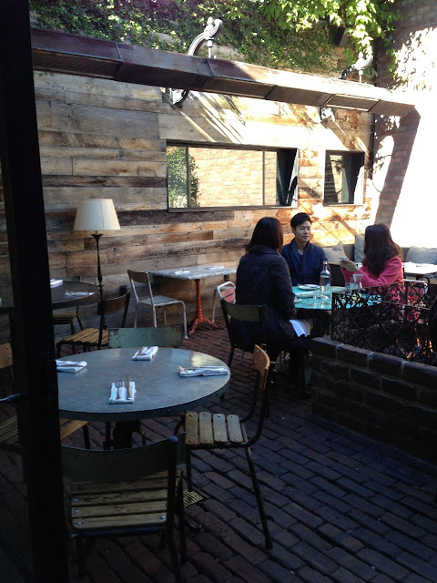
When I was in Venice last month I stopped in at gjelina on Abbott Kinney for a little lunch by myself.   Which is perfectly fun if you ask me.  I was a bit before the lunch rush and much of the restaurant was empty when I started taking photos inconspicuously with my phone.  I know it is bad but I like to take photos of things that make my imagination spin, and I was not sure if they would say yes.  
It is one of the best restaurant interiors I have seen in California lately, and I fell for the boho charm that was pouring from everywhere, even the wait staff had a little boho hippy vibe going on.  
 They have a great vintage mix of furnishings and details, with a lot of communal seating which reminds me of  my favorite restaurants in France.  

Usually a  restaurant with a great vibe will carry it all the way to the bath rooms.  Which they definitely did and they did it well.  I loved the little wheel to turn the water on and off mounted directly through the mirror.  Hello!


Super cool embossed wallpaper in the hall.


Not to mention that my lunch was amazing.  By the time I was finished the place was full and a little loud.  I left wanting to come back for more- with a friend even would be nice!


www.gjelina.com   
Address: 1429 Abbot Kinney Blvd, Venice, CA 90291
Phone:(310) 450-1429


images by christina for greige

Photobucket If you would like help creating inspirational spaces for yourself contact us!

  Follow my blog with Bloglovin

Senin, 24 September 2012

, , , , , , , , ,

Good Food Center Street Anaheim


Yesterday morning we went to the small flea market in downtown Anaheim, there was not much for me at the flea market but I fell in love with the new shops in the area.  This little cafeteria style restaurant was one of the best local designs I have seen lately.  LOVED the doors and windows along with the tile detailing and furnishings.  A great concept and very well done.  There are 3 eateries in the space and then there is communal seating inside and out.   


It is a little hard to tell from the photos but the front of the building is curved which I love loved.


Need to make some of these for outside at our house!


images by christina for greige
Photobucket 

Senin, 10 September 2012

, , , , , , ,

Shop design {industrial mix}


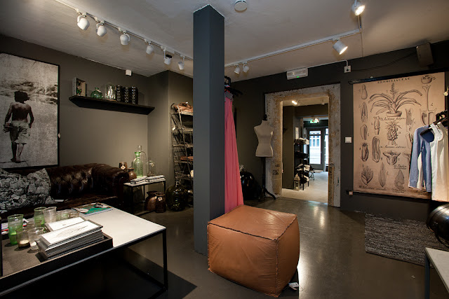
I am completely in love with this shop!  I have a thing for a mix of home goods and fashion though.  I think that they go hand in hand and that typically those who love to decorate love to dress in a similar fashion.  Don't you think?  

This space is fantastic, one of those shops I could spend too much money in and come home feeling very inspired!  I love the way the bright colors of the clothing play off of the relaxed darker furnishings.


images via

Photobucket